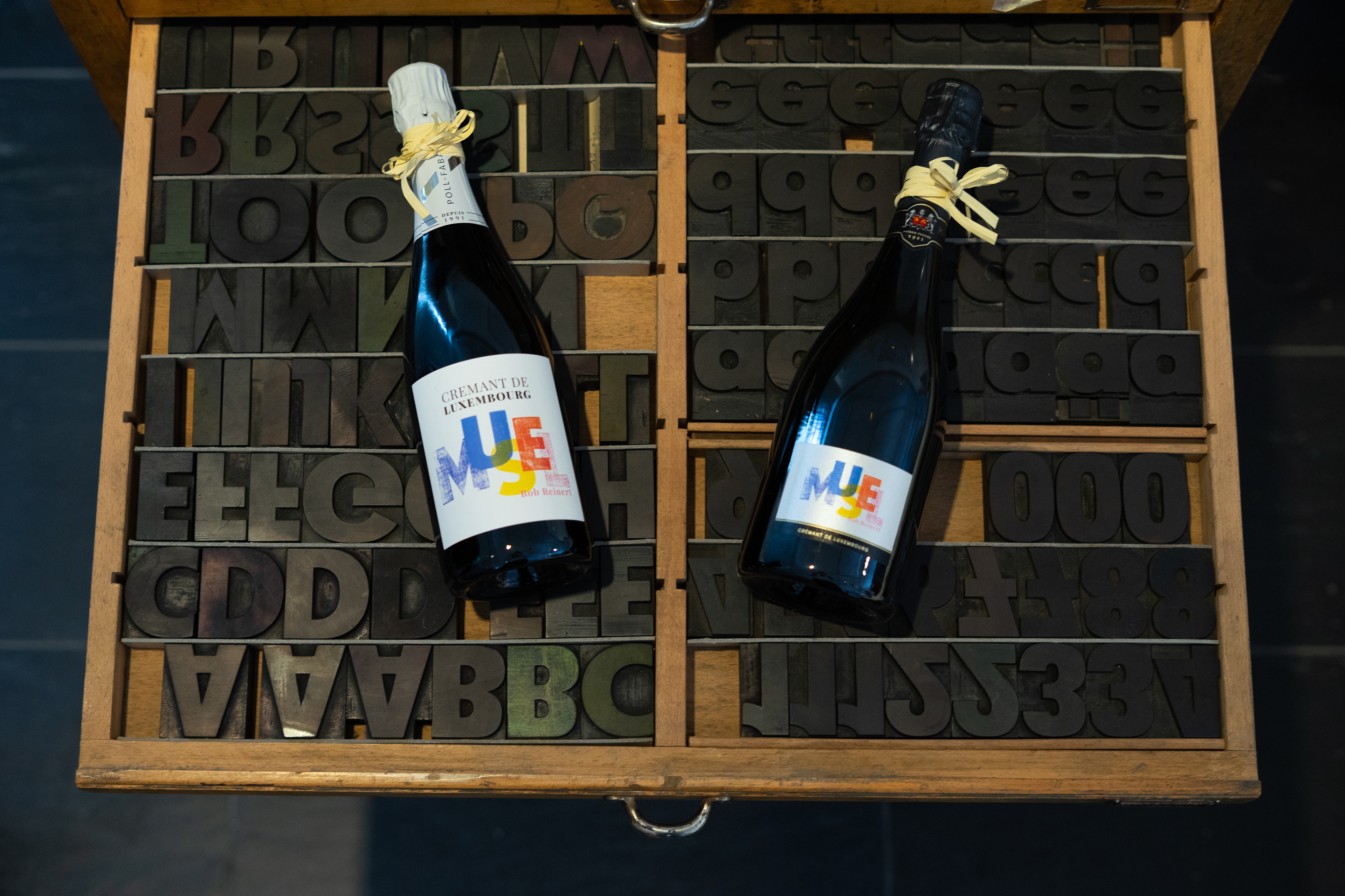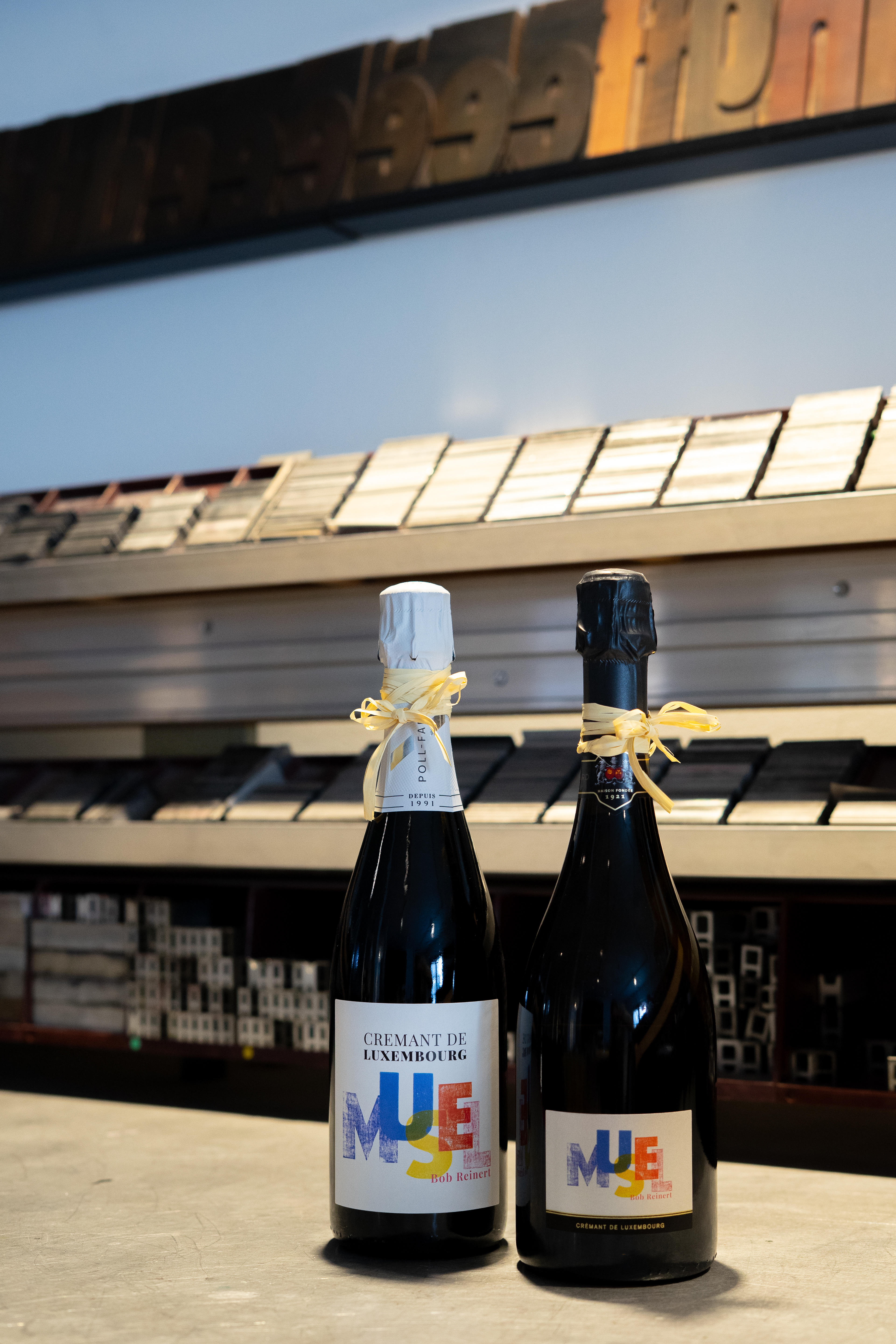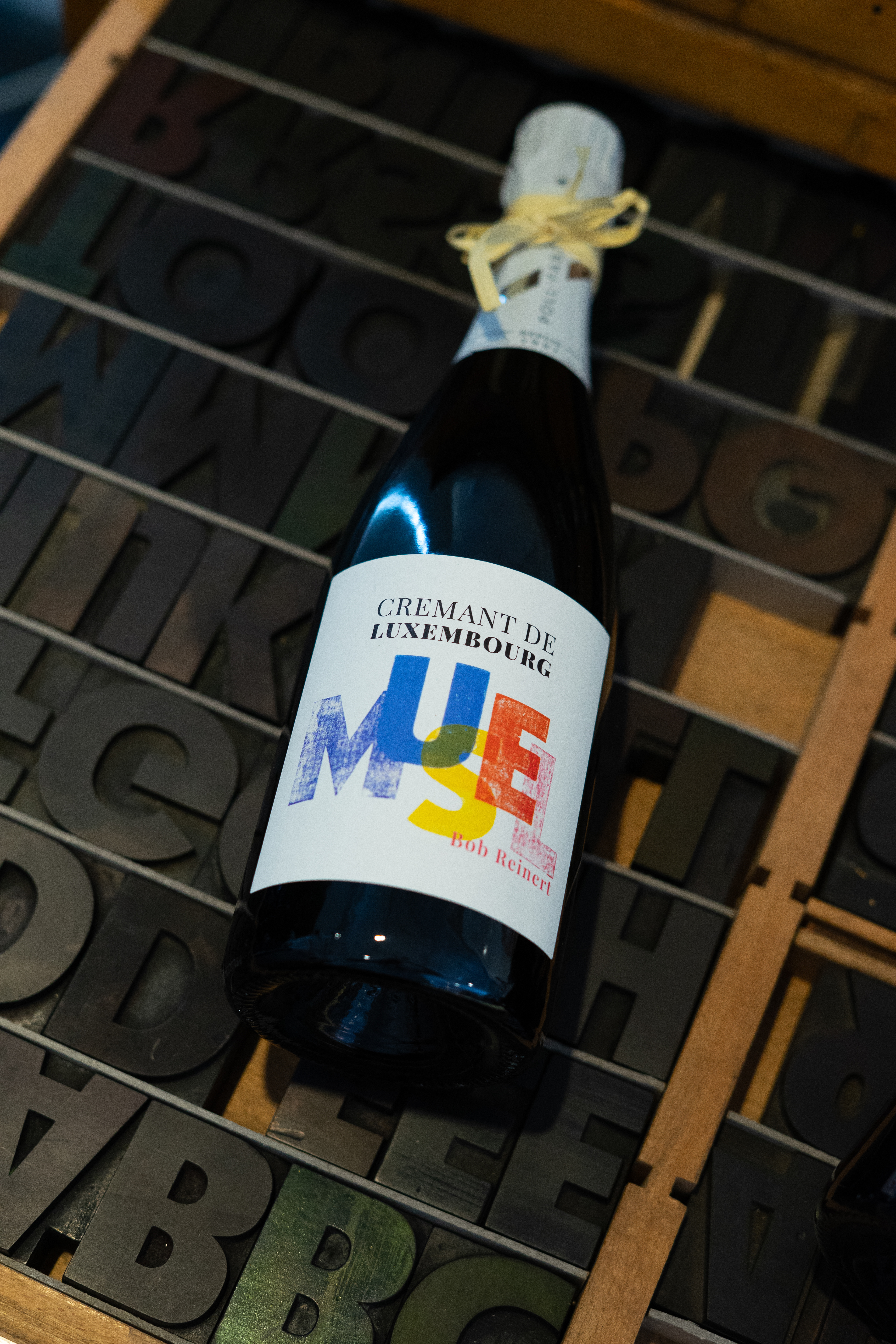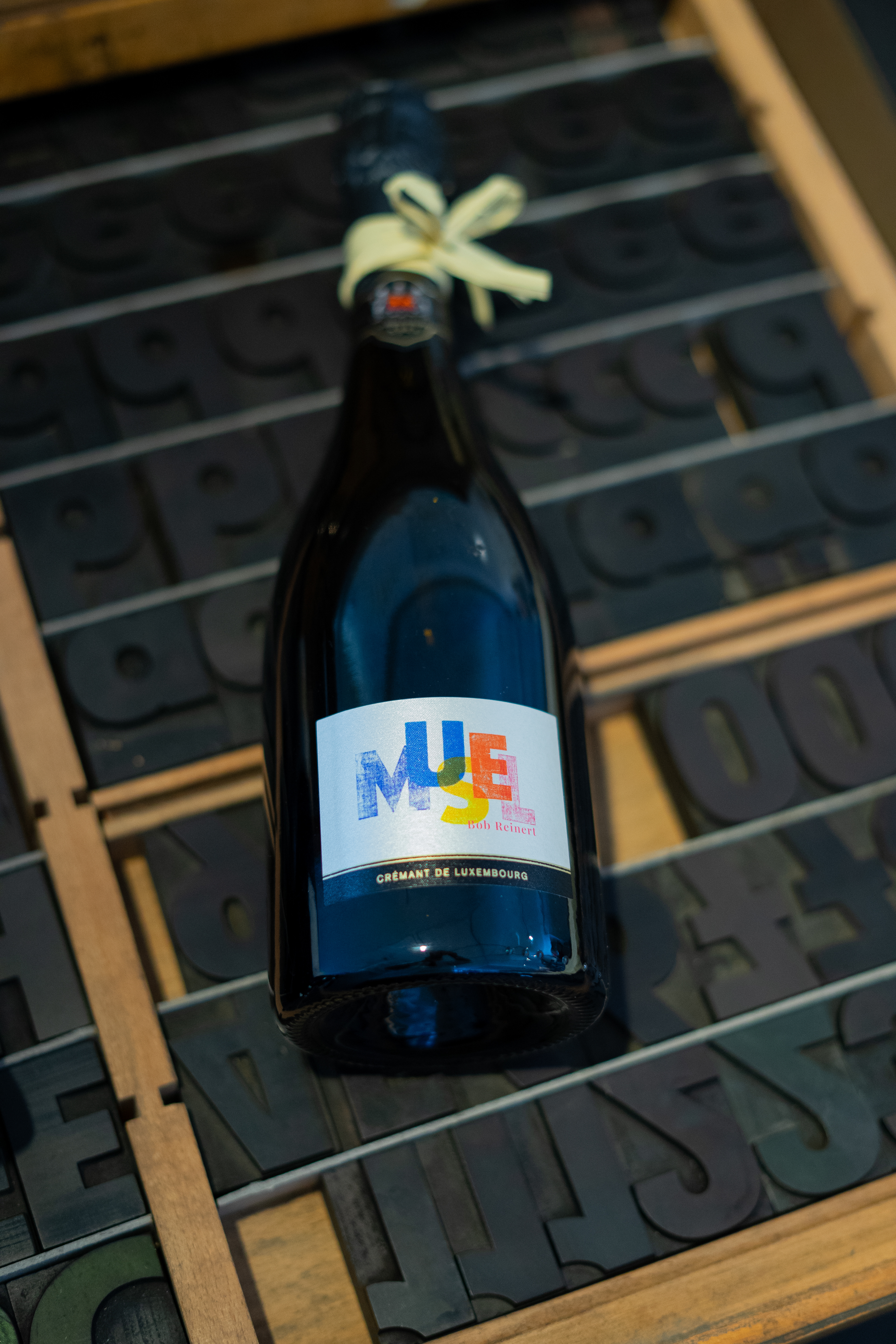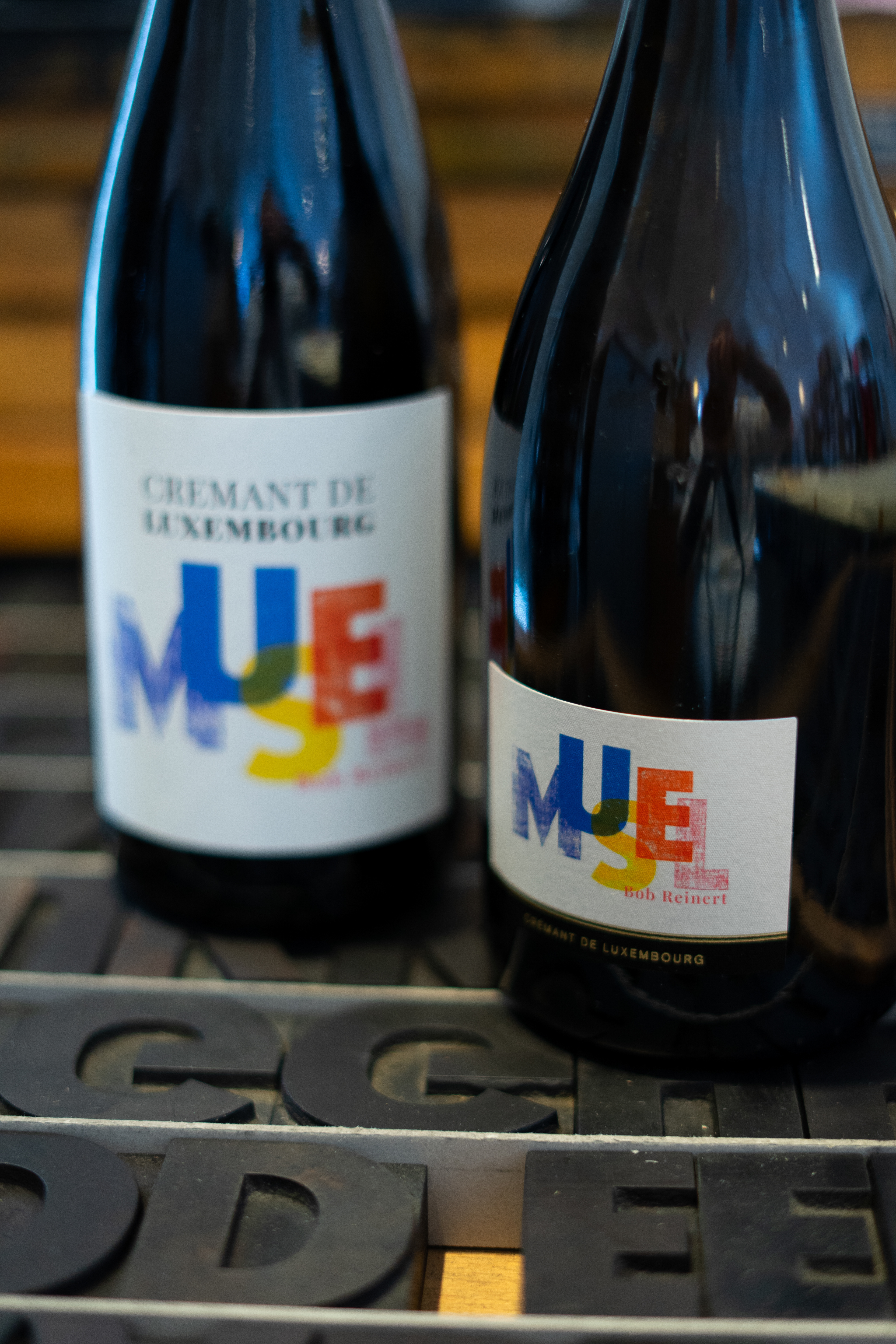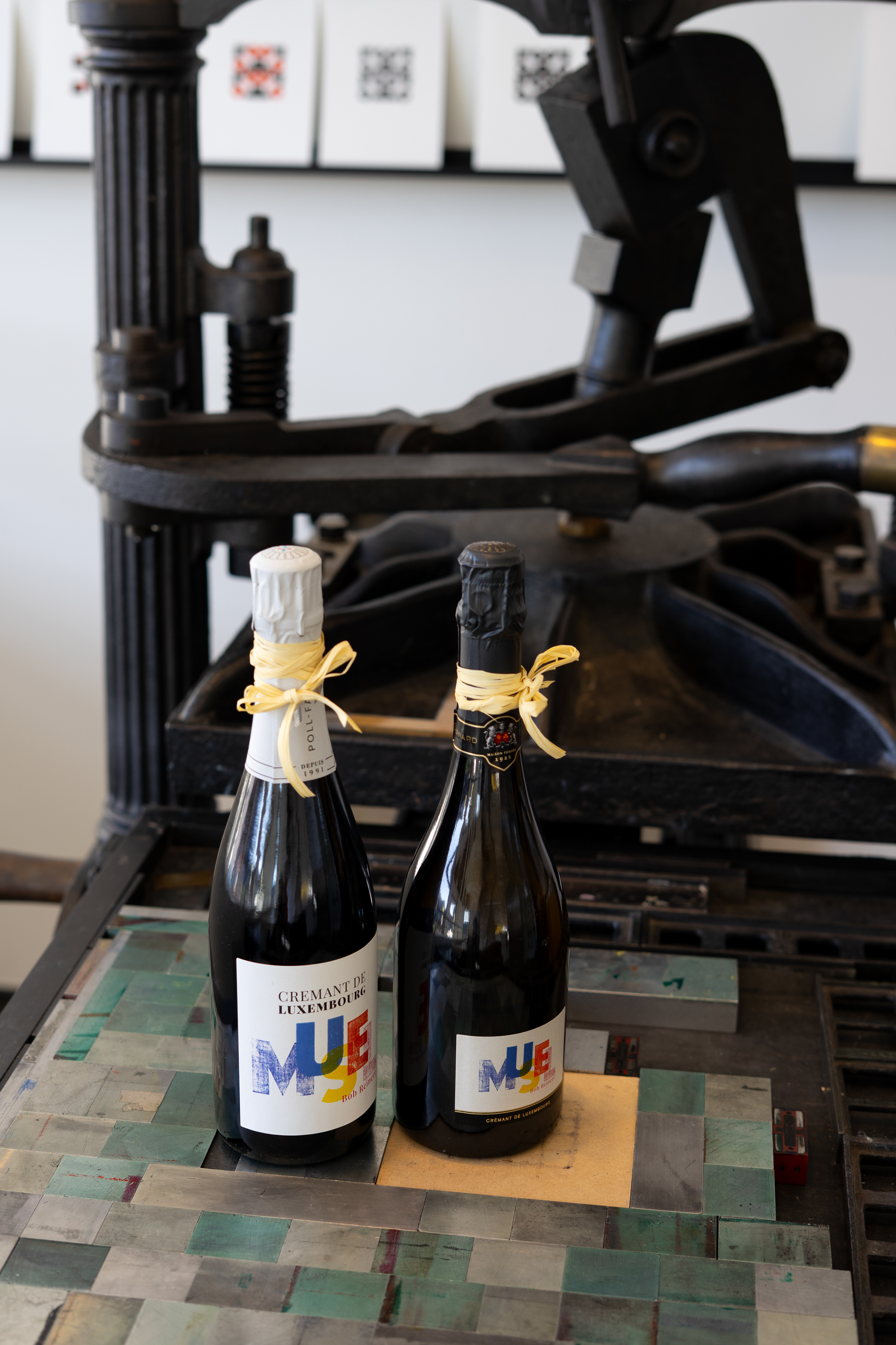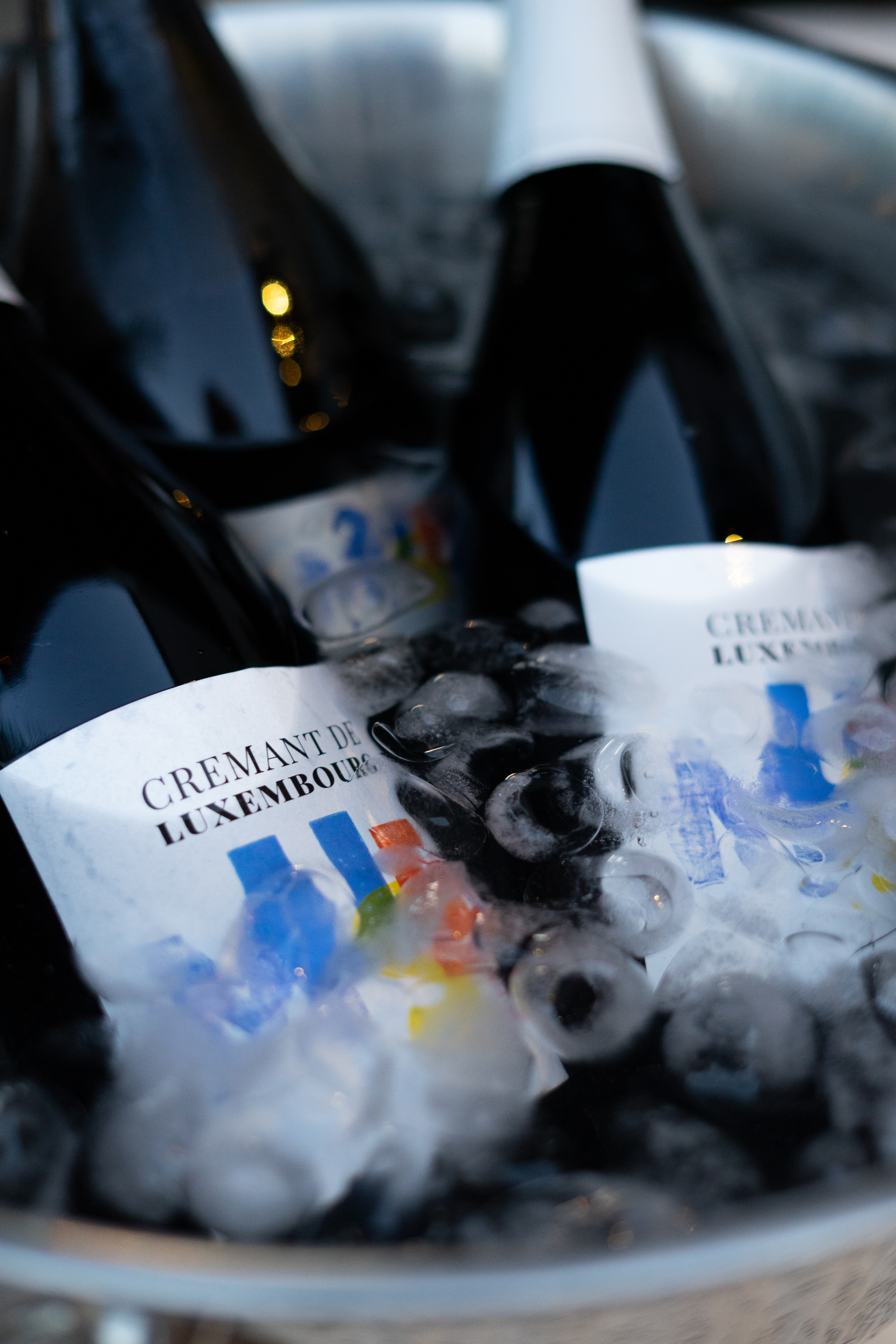
To mark the 25th anniversary of Grevenmacher’s Kulturhuef Museum, my design was selected for a special edition champagne by Poll-Fabaire and Bernard-Massard.
The project began during a workshop day inside the museum’s printing facility, an incredible space packed with Gutenberg presses, letterpress blocks, and historical print machinery. I spent the day working completely freely, treating the archive as a playground. I wanted to experiment with the tools outside of their original intentions, quickly testing ideas and layering different manual techniques.
In the letterpress section, I found a beautiful, bold sans-serif wood type font. Instead of locking the letters into a traditional printing press for a rigid, perfect alignment, I inked them up and stamped them one by one by hand. This physical process allowed for subtle, organic textures in the typography. To integrate the local identity, I experimented with a stylized color palette to mirror the municipal coat of arms.
While the anniversary designs have traditionally featured classic linocut illustrations, I was thrilled that the museum embraced a typography-forward direction this time around. The final design celebrates the city, the Moselle region, and the museum’s letterpress heritage in a single, tactile composition.