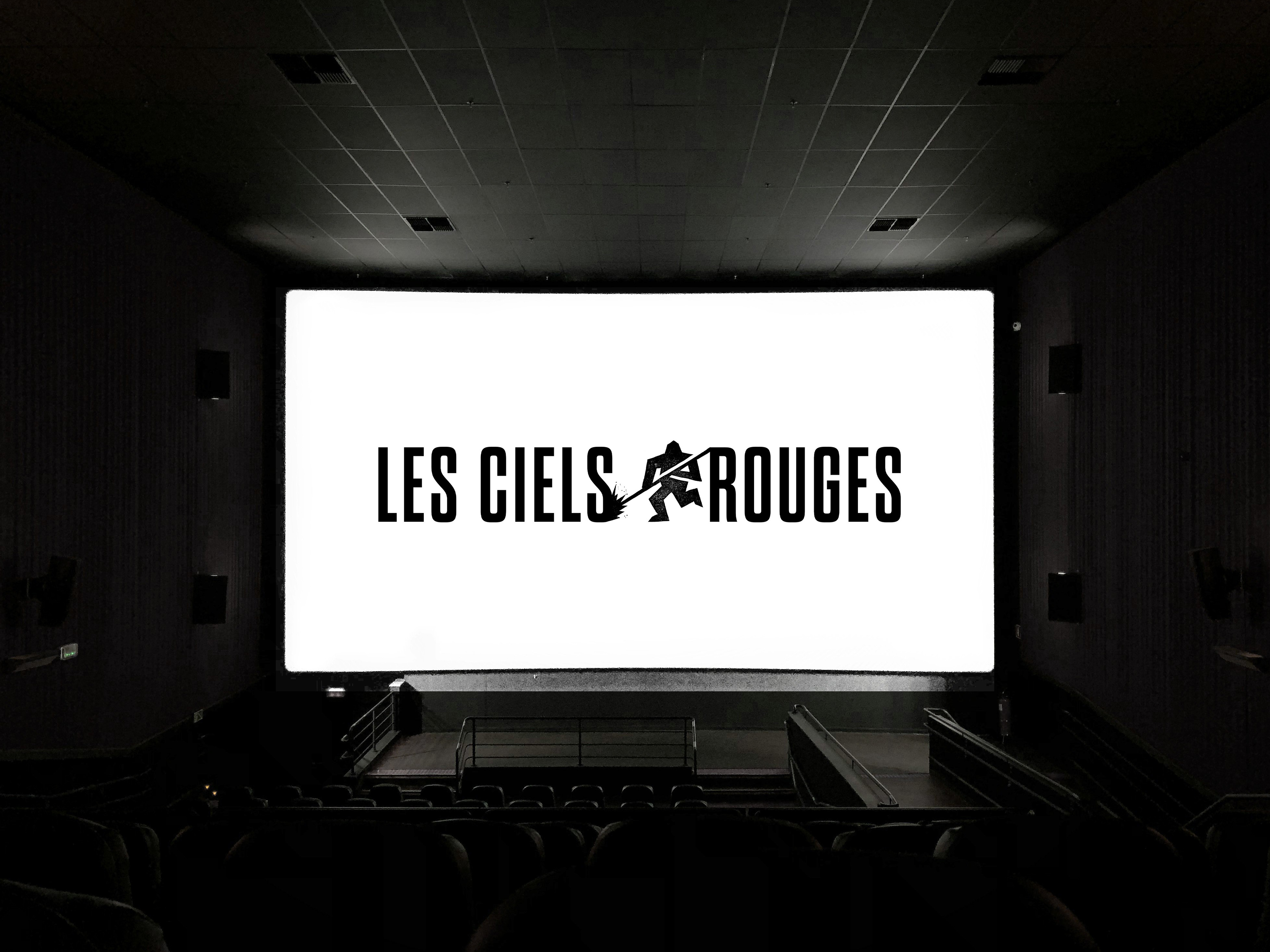
I developed the brand identity for the film studio Les Ciels Rouges, a name that plays on Les Terres Rouges, a Luxembourgish region famous for its rich, reddish soil and deep roots in the steel and mining industry. Because both filmmakers grew up there, I wanted the identity to feel deeply personal. I took a deep dive into the region’s history by researching vintage typography from old mining sites and building a color palette directly inspired by the iron-rich earth and the shifting hues of molten metal.
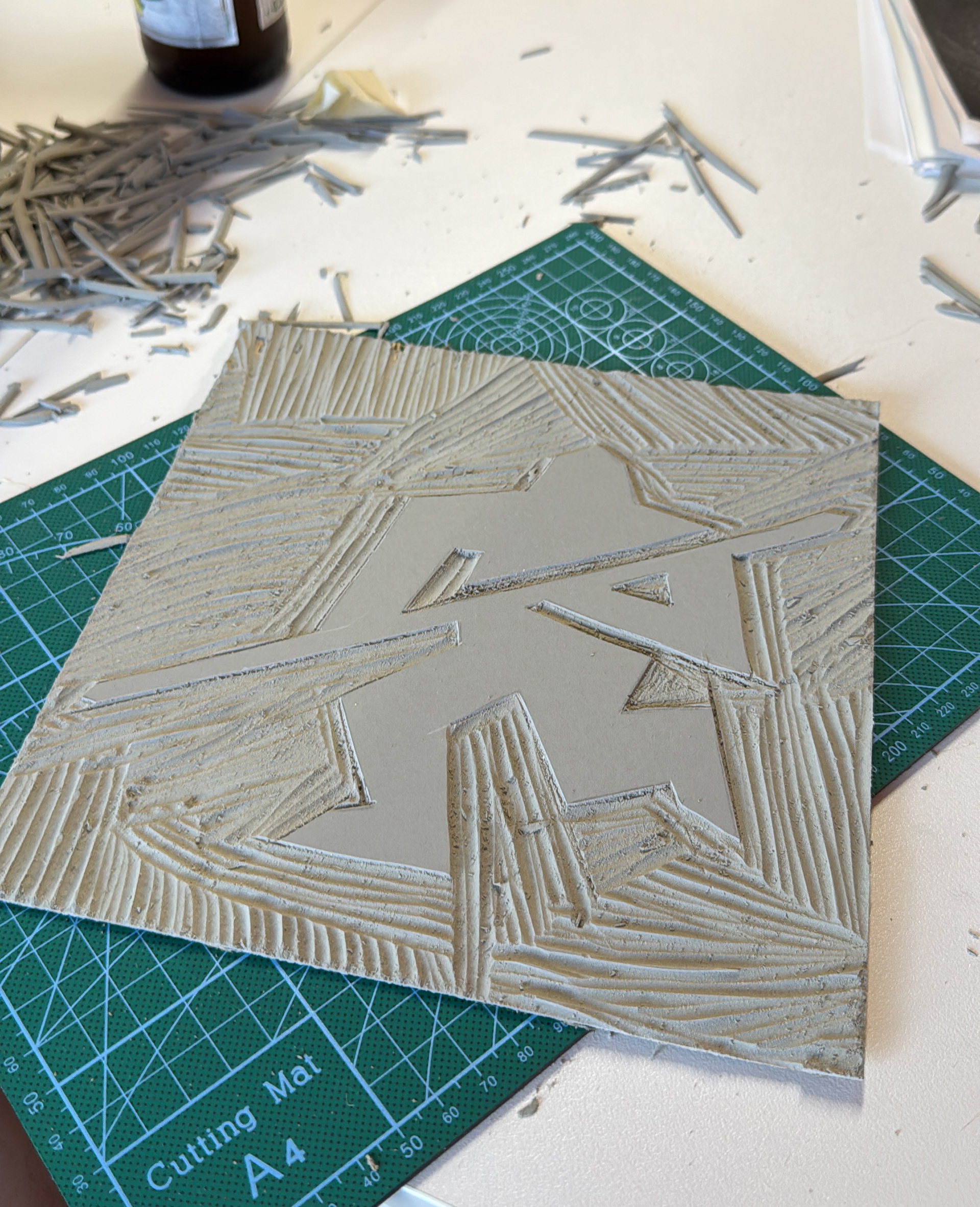
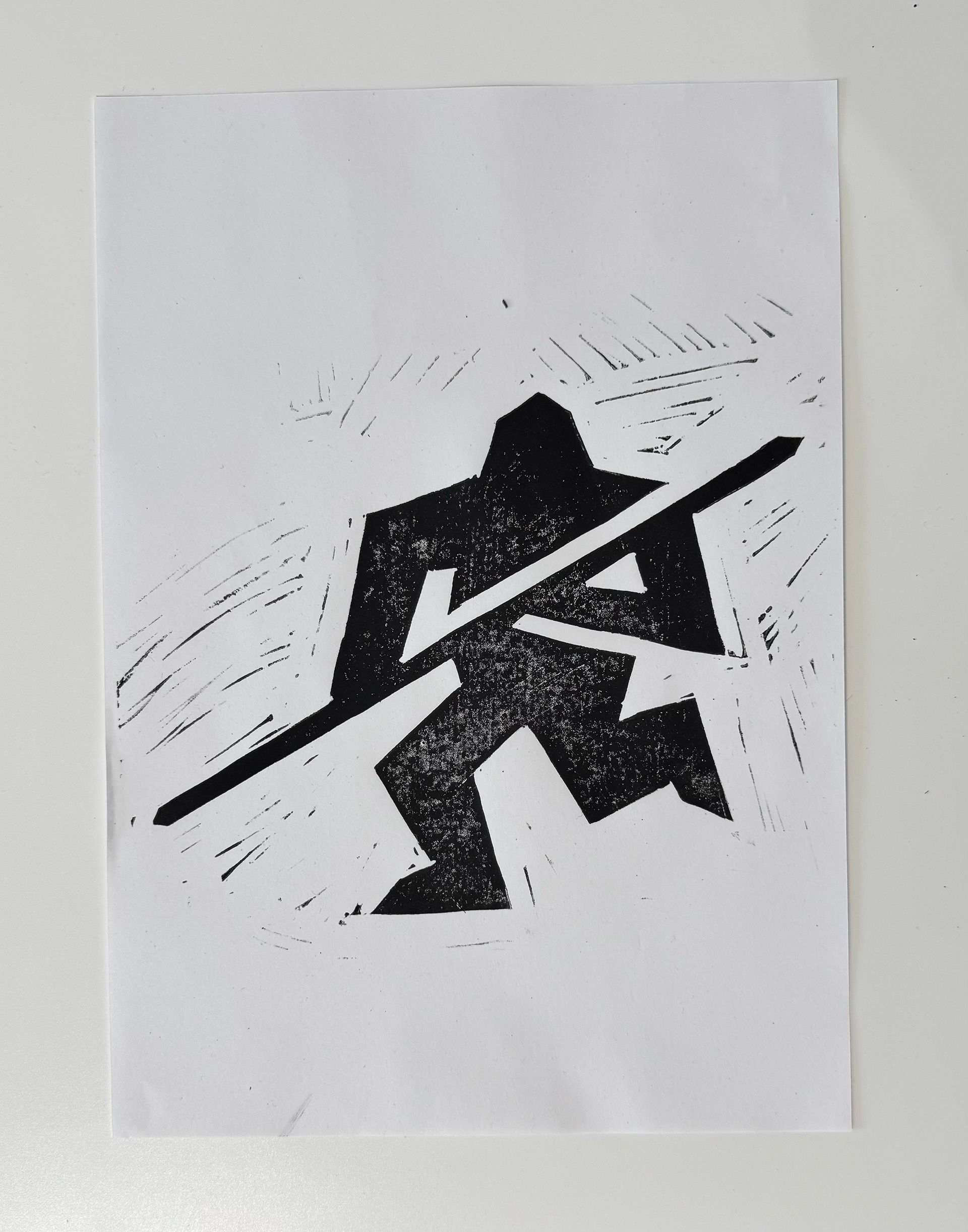
We quickly agreed that a sleek, corporate logo would feel totally wrong for their raw filmmaking style. Realizing that both cinema and heavy industry are fundamentally hands-on crafts, I decided to step away from the computer and use a physical printmaking technique called linocut. I hand-carved a small, stylized character inspired by the historic workers who managed the blast furnace fires called "Feierstëppler". Designed to be animated and flexible during film credits, and paired with a custom font mimicking industrial warning signs, the final identity feels modern while remaining fiercely proud of its historical roots.