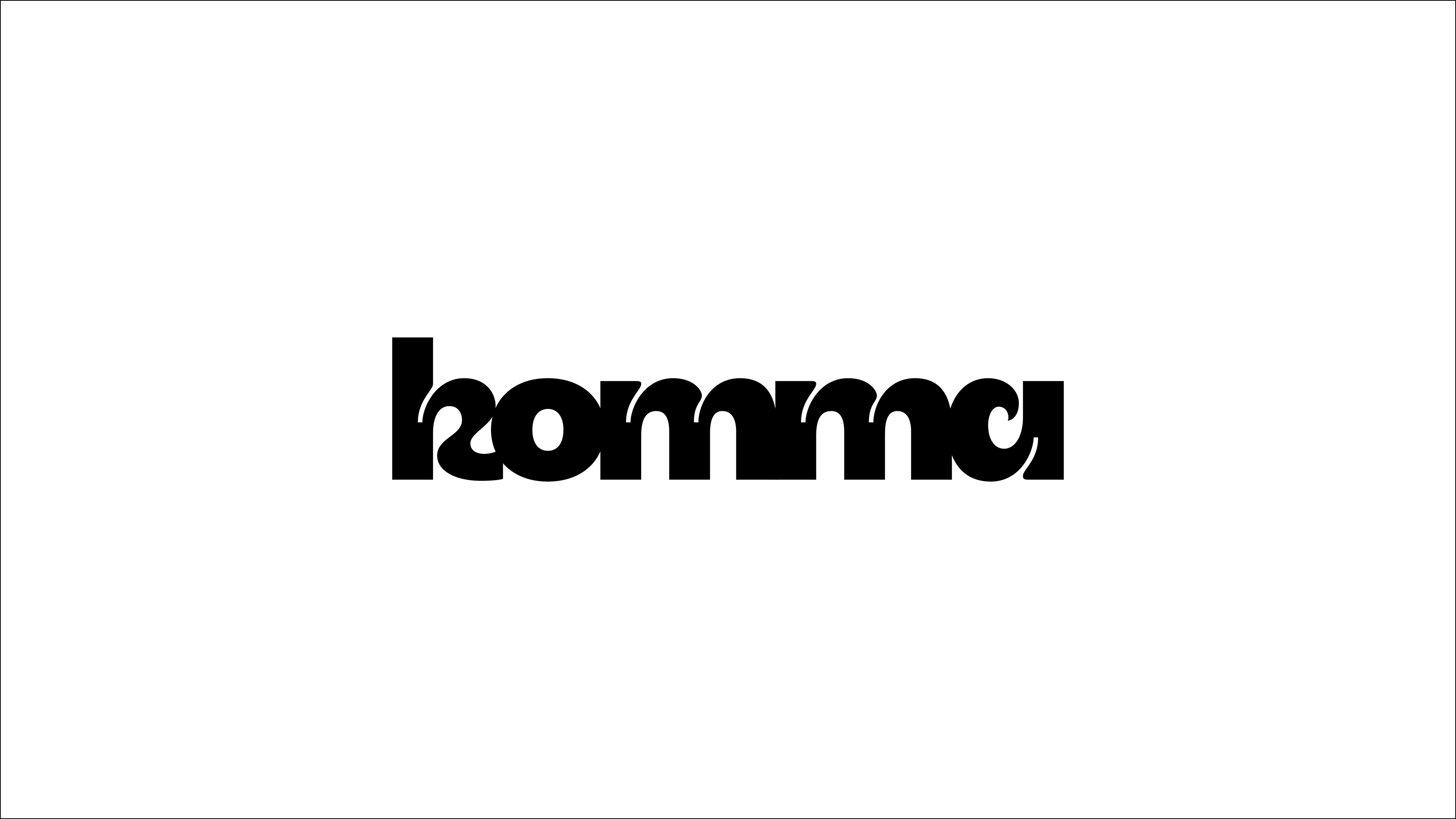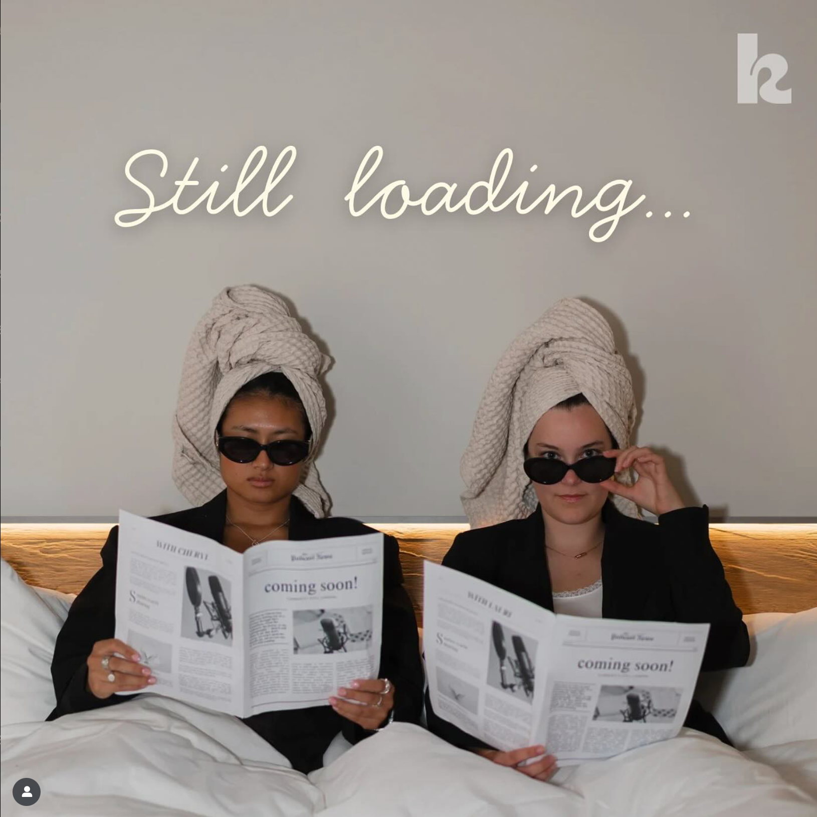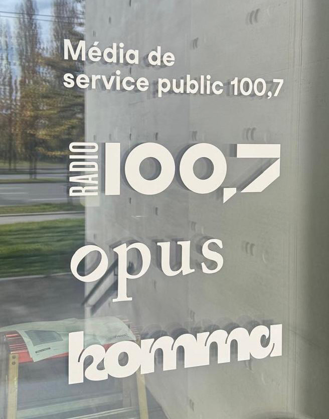
komma is the youth platform of Radio 100,7, built as a dedicated space for young voices in Luxembourg to share their stories and perspectives. The visual identity was developed to capture the literal "space in between," mirroring that transitional, chaotic stage of growing up and figuring things out, which is the case for both the young adults and the platform itself.
While vibrant colors give the identity a lively, unmissable presence, a heavy grotesk typeface brings serious credibility without sacrificing the playful soul of the platform. Inside the logo, custom ink traps act like small pauses or commas, creating subtle breaks in the typography. A flowing, brush-like stroke cuts through these rigid interruptions to introduce a constant sense of motion and fluidity.
The resulting design strikes a perfect balance between structure and spontaneity, creating a living visual language that adapts to the individuality of the youth community it represents.